Vector image generation
An icon, an illustration or an emblem — from one description and straight into SVG. A vector doesn't blur on a business card or on a ten-foot banner, and the file's background is transparent from the start.
Create a vector from a descriptionA rocket lifting off with a jet of flame and a puff of smoke

Real SVGs, not pictures in a frame
The page loads every file below as a vector — it is the very SVG the tool returned. Under each tile is the request it came from.
SVG SVG
SVG SVG
SVG SVG
SVG SVG
SVG SVG
SVG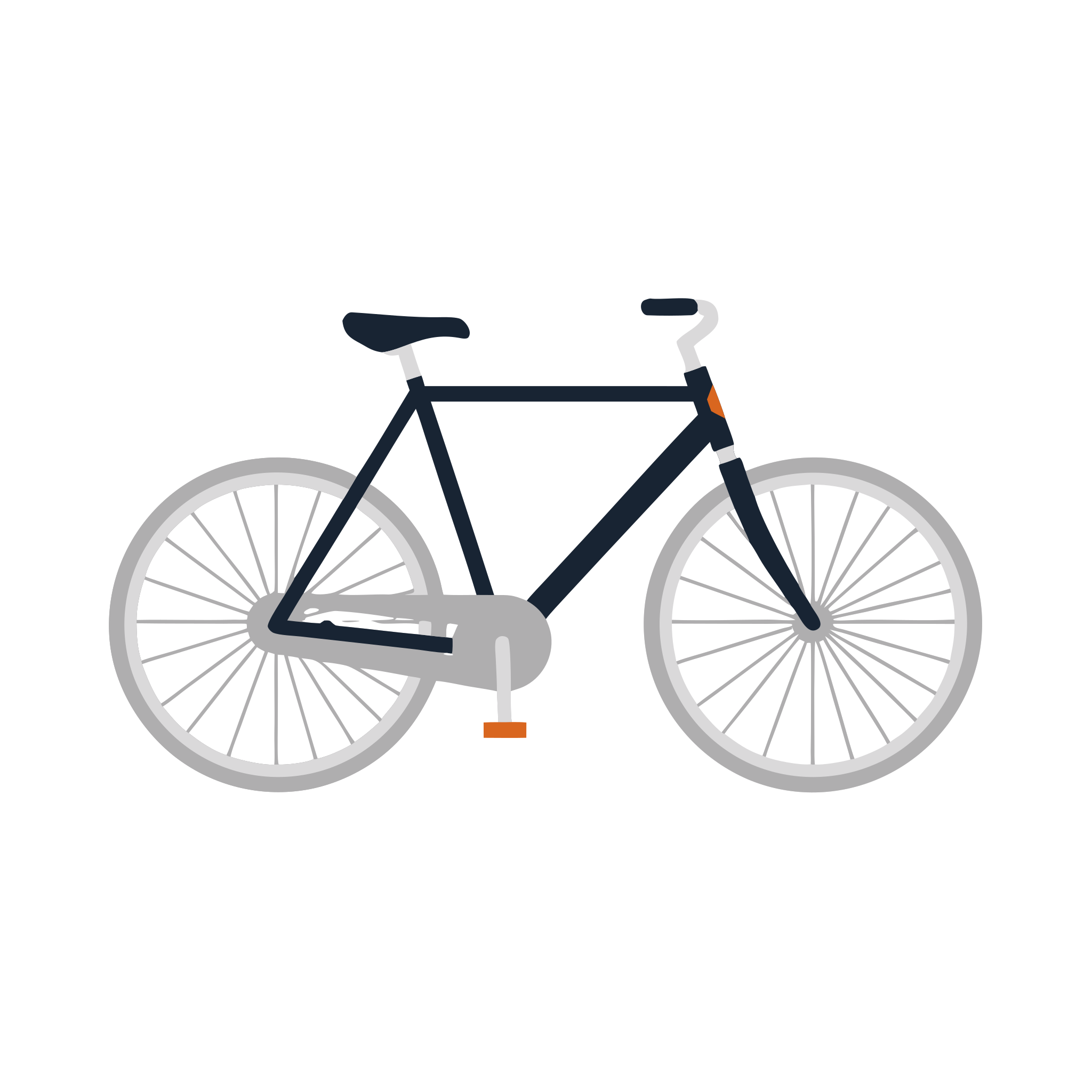 SVG
SVG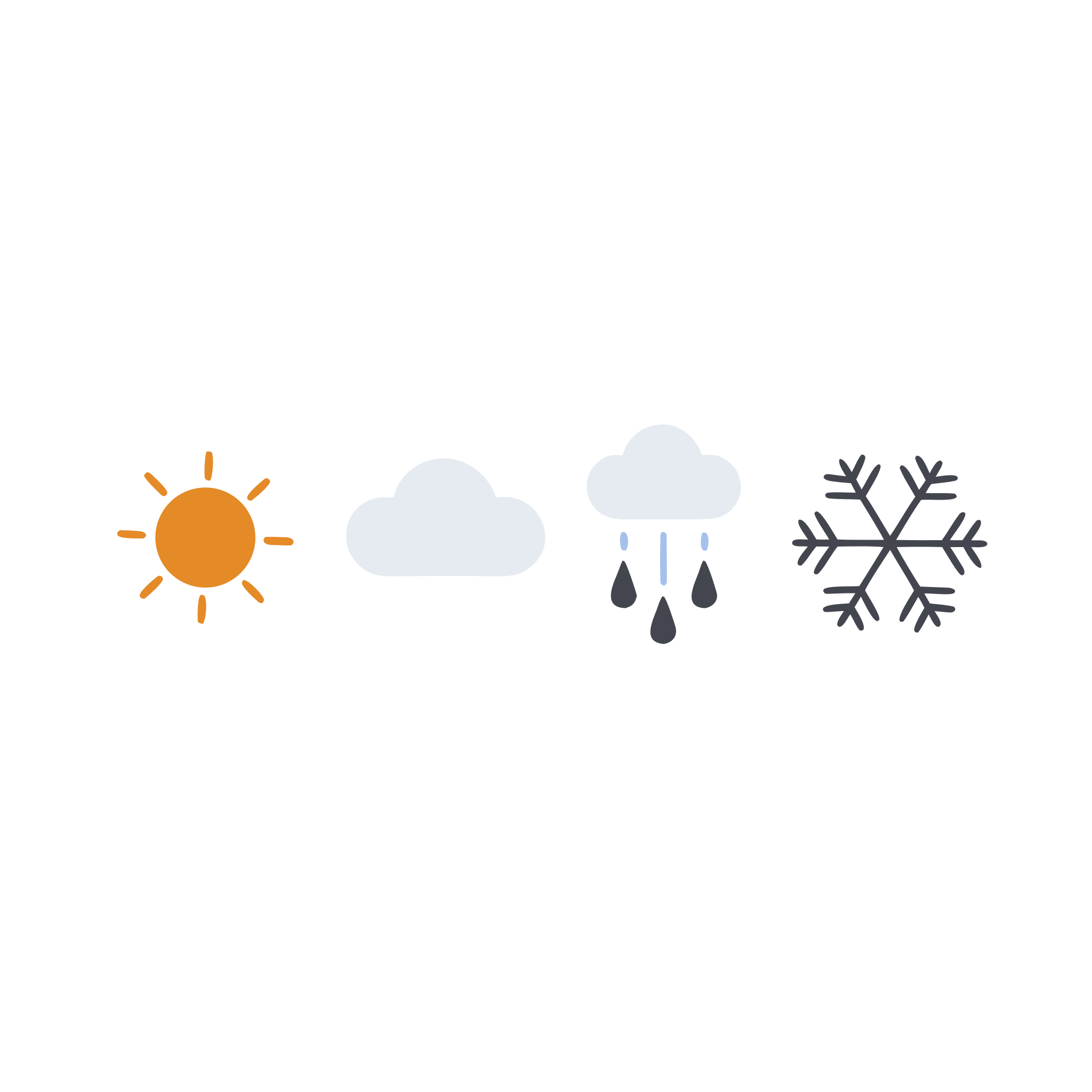 SVG
SVG SVG
SVG SVG
SVG SVG
SVG SVG
SVG SVG
SVG SVG
SVG SVG
SVG SVG
SVGWhy a vector beats a picture
The same illustration works in a favicon and on a wall-sized banner.
Scales without loss
An SVG is made of curves, not pixels: blow an icon up twenty times — the edges stay just as crisp. For print it is the only right format.
Transparent background by default
No white rectangle, no grey fringe around the illustration — it sits on any backdrop and any color.
One style for a whole set
Repeat one style formula in every request — and you get a series of icons that reads as one kit, not a random collection.
Weighs almost nothing
A finished illustration is tens of kilobytes instead of megabytes. A page with two dozen such files loads faster than a single photograph.
How to get a vector illustration
The tool walks the whole path itself: draws a flat illustration, removes the background and traces it into curves.
- 1
Sign up for SUPA and open a project
- 2
In the AI section, pick vector image generation
- 3
Describe what to draw: the object, the composition and the palette. The simpler the shapes, the cleaner the vector
- 4
Run the generation — an SVG with a transparent background lands on the canvas, ready for scaling and print
How to describe an illustration so it traces well
Ask for flat shapes
A vector lives on fills. The words “flat illustration”, “solid fills”, “clean contours” give a clean result, while “photorealistic”, “3D”, “with highlights” give a mush of tiny curves.
Limit the palette
Four or five colors look like a deliberate system and trace into neat contours. Gradients and halftones turn into dozens of nearly identical shapes.
Keep the composition simple
One object in the center reads at any size. A complex scene with tiny details becomes a blob on a 24 × 24 icon.
For a set, repeat the style wording
Change only the object itself, and keep the style description — line weight, palette, degree of rounding — word for word the same. That's how a series comes out uniform.
Add text in the editor, not in the vector
Letters drawn as shapes can't be rewritten, and the font can't be changed. Generate the mark and set the caption on top — it stays editable text.
Frequently asked questions about vector generation
What exactly do I get?
An SVG file with a transparent background. You can download it and open it in any vector editor — the contours stay editable.
Can I recolor a finished illustration?
Yes: the fills are separate objects, so the color changes like on any shape. The easiest place to do it is right in the SUPA editor.
Will it work for a logo?
As a base for a mark — yes, especially for simple shapes. But a logo is also about uniqueness: before registering a trademark, refine the result with a designer.
Why are there so many contours in the file?
The more complex the source illustration, the more shapes it takes to describe it. Simple forms and a limited palette in the request are the surest way to a light file.
Is the result good enough for print?
Yes. A vector doesn't depend on resolution, so the same illustration prints equally crisp on a business card and on a banner.